
Sunday, 16 December 2012
Front cover (rough draft)
This is the first rough draft for the front cover of my music magazine. I have not gone into too much detail, as it is just a basic layout and things will be taken away and added as I make improvements

Sunday, 9 December 2012
Interview for Magazine
Kara
Coleman Interview
Quick fire
questions
What is
your favourite colour?
Red
What is
your favourite alcoholic drink?
Cheeky
vimto
What was
your first pets’ name?
Chris,
he was a goldfish
Who is the
last person you called?
My
mum
What is
your favourite saying to live by?
“You must give up the life you planned in
order to have the life that is waiting for you.”, Joseph Campbell
Would you
rather
Would you
rather be too cold or too hot?
Too
hot
Would you
rather have your mind serve as an iPod so you can listen to music whenever or
watch your dreams on TV?
Watch
my dreams on TV, any day!
Would you
rather know the future or wait and see?
Wait
and see, otherwise it would change!
Would you
rather have your crush like you, or know who likes you at all times?
Know
who likes me at all times, who wouldn’t want to know that?!
Would you
rather, only have 80s clothes or 80s hairstyles?
80s
clothes! I love all that stuff!
Interview
So Kara, two years into your solo career, how’s it
going?
Yeah
its good thanks! So different from being in a band, because obviously before I
would tour with the guys, but it’s been fun.
So what happened with the band?
I
guess we just decided it was time. We had been together since we were 15, and
after 8 years together, we decided to end on a high.
Do you still see the guys?
Yeah
of course! I see them all at least four or five times a year! We all grew up
together so all of our families are really close.
Who would you say you’re the closest to? It was
rumoured that you were dating Dan, want to shed some light?
You
can’t ask me that! They’re all like brother to me, which means no, me and Dan
never dated!
Whatever you say! So, you’ve had three top 10 albums,
6 number ones, and two international tours, all in the space of two years! How
do you do it?
I
don’t even know myself to be honest! I think if you have a real drive and passion
to do something, then you do it, and for me, it’s the music .And also the
people! You never know who’s going to pop up next and I love waiting to see who
I meet on my travels!
Speaking of travels, where are you off to after this?
Home!
I can’t wait to go and catch up on the jungle!
Haha! I won’t tell you who won then! Where are you
touring next?
We’re
touring all over the USA next, I can’t wait!
So Kara, where is your favourite place to tour?
Everyone
always ask this! Hmm, obviously everywhere you go, the crowds are different,
but I’d have to say that I love touring Britain the most! They’re the hardcore
fans that knew me from when I was 15.
So what’s your favourite thing about performing?
That’s
so hard, but I really love it, when I’m getting into a song, and I just stop
for a moment, and realise that that people are singing along with me! It’s
like, whoa!
It must be amazing, I can’t even imagine. So do you
ever get nervous before you go on stage?
I
guess, to some extent I’m always nervous, especially if I’m waiting around to
go on stage, but usually my adrenaline kicks in the minute I hear people and all
I can focus on is performing
Do you have any warm ups, or lucky items or anything
like that?
I
do have a lucky friendship bracelet my friend from back home gave me that I
wear for every performance.
Do you believe it helps?
This
might sound really silly, but one time I left it in my hotel room and that
night, I fell off strange and broke my ankle, so it’s safe to say I’m
suspicious and won’t be risking it again!
That night when you fell off stage in Manchester, a
fan caught you, and you were then pictured with him after, and again recently,
is there anything you want to tell us?
There
is nothing going on, we see each other whenever I’m in Manchester and we’re
good friends, but that’s as far as it goes
Okay, so that night, you were advised against it, but
you carried on your concert, what made you decide to do that?
I
didn’t really give it a second thought really, I was just like, if these people
can be bothered to come and see me, then who am I to cancel halfway through?
Okay, so that last thing, is Reading. It has been rumoured,
that you are headlining this year…
I
guess you’ll have to wait and see…
Sunday, 2 December 2012
Contents Page Pictures
Here are some of the first contents page pictures I have taken. I haven't picked which picture I want to use yet, or how i want each picture to be edited. I will still be taking some pictures of other people to add to the contents page to make it more realistic and will be taking the pictures for the front cover and double page spread on Monday.


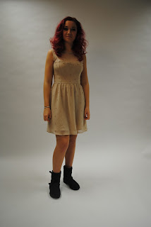
Magazine Pictures
Here are some different pictures that I took for my magazine. As you can see, I tried to get a variety of different poses and postions. I also tried different camera shots such close-ups, medium close-ups and wide shots. I also played around with the lighting to get the best possible pictures. I shot these pictures uisng a NIKON D3000, this helped me produce more pression pictures than using a normal digital camera which I used for my preliminary task.


Monday, 26 November 2012
Barcode
I have decided to take a picture of an existing barcode, to make it look as realistic as possible. This is the barcode I will use:
 I might edit this barcode to make the background brighter.

Pictures
Pictures that I plan to use for my magazine include:
Front Cover
Front Cover
- Will be a picture of my friend Mollie, she is 16 and has bright red hair. She will be styled in either a dress with ankle boots, or a black top, black trousers, ankle boots and a blouse thing. She will have curly/messy hair and will have think black eyeliner on. She will stand against a white background. Then she will sit on a black chair, still against a white background.
- There will be a picture of Brendon, standing against a brick wall. He willbe ina t-shirt with graphics on it, and plain black trousers. He will also have a guitar. (I have already taken these pictures)
- There will also be pictures of my friend Bradley. He will either be sat in a park, with leaves and a scene set up. Or he will be on the street.
- There will also be pictures of two of my friends(girls) dressed in festivals clothes, with wellies and bright colours. They will have UV paint on their face. They will be in a field with a tent up to make them realistic. There will also be cider/alchol cans/bottles to make the scene more realistic.
- There will be picture of Mollie (same person as front page),not posed. They will be simple pictures of her smiling/laughing and you will probably be able to see the set (lights) to show that it is 'behind-the-scenes'.
Names for my magazine

Here are the three names that I am currently deciding between for my magazine. As I havnt decided what I would like to name my magazine yet, and I havn't decided which font I would like, I have tried all three names in both fonts. I am also thinking about the name, headline, as the magazine will be largley based around gigs, tours and festivals.
The words on the right are in the font rosewood. I think that this would suit my magazine well because it reminds me of a rock magazine, it is a bold font, and has some detail which will make it stand out on the cover, so it is easily recognisable as the masthead.
The names on the left are in the font Native. I also like this font because it is simple, but also has a good look for a rock magazine. It will stannd out on the page, even if it is just black. I think it is also a good font for the genre of my magazine, because it looks similar to fonts which headline acts would be printed in.
Monday, 19 November 2012
Publication Plan
Publication Plan
Font of
name: Native? Rosewood?
Positioning
statement:
Frequency
of publication: Monthly
Price: £2.95
Distribution:
W.H.Smiths, most newsagents, Waitrose
Rationale: (what is the thinking behind the magazine - have you
identified a gap in the market?)
identified a gap in the market?)
Style: Indie/rock- Mostly dark with a few bright colours from fonts/pictures
Regular
content: Tour/festivals dates, reviews,
interviews from bands, latest fashions
Feature
content in your issue: Popular musician, middle of
second tour, just released new tour dates and it has been rumoured that she is
headlining at Reading next year
House style: The font for the title will be big, and bold but will be different from
subheadings and article. The article might be in Times New Roman or Calisto MT. The subheadings will be in a similar font, and will be smaller than the
headings. They might be bold of in italics.
Analysing Double Page Spreads
Double Page
Spread
The two
magazines that I have chosen to analyse for their double page spread are Q
magazine and We Love Pop. There are many difference between these two magazines
in general, for example genre and target audience and this is shown throughout
the magazine in things like their double spread pages.
The target
audience for the ‘We love pop’ magazine is obviously young/teenage girls that
are most probably more interested in the person as opposed to the music; this
is shown through the layout, the images and the language used. First of all,
the language used reflects the target audience of the magazine as it uses
simple language for the questions, but picks out the most interesting words to
draw attention to the article, for example, the second biggest writing on the
page says “There was nothing creepy about Harry and Caroline at all.”. The word
‘creepy’ will attract attention, and make the readers want to know what was
creepy. This quote also mentions two other celebrities, which means that
readers who are a fan of those celebrities might be more inclined to read the
article. A lot of the double page spread is also about Tulisa’s career on ‘X
Factor’, which means there might be a lot of gossip in the article and maybe
not so much about her music career. The layout and pictures used for this
article also reflect what their target audience is. The first page of the
article, has two quotes are the top, to show what might be included in the
article, but it also has a picture in the middle and writing around the edges.
With their target audience being teenage girls, they might acknowledge that
they might be more interested in the pictures than the article itself, this
could be why although it looks like there is a lot of writing, and the main points
from most of the questions have been pointed out so the reader can just skip to
the next page. This is also shown by the next few pages, as the second page is
just a big picture of Tulisa, and the next two pages have picture taking up a
majority of the page and a few questions down the sides, showing that the
pictures are the main focus of the page. The pictures used in this article
clearly show that their main target audience is young/teenage girls as all of
the pictures show Tulisa is bright colours, smiling and usually with one or
more other celebrities that will attract the readers’ attention even more.
However the
target audience for the ‘Q’ double page spread is very different and is also
shown through the layout, pictures and language used. The target audience for
the ‘Q’ magazine article might been either sex aged between 16-30 who are
interested in rock music, or people who are particularly interested in the band
‘Biffy Clyro’. There is only one picture used in this double page spread, which
takes up one whole page. The picture shows the band, topless, drinking and sat
at a messy table, filled with beer cans; this picture reflects the nature of
the interview and implies that the band like to party. The caption for this
picture says “Biffy Clyro: another quiet night in front of The X Factor” and it
is obvious from the picture and the genre of the magazine that this is mocking
the TV show and probably people who watch it. The picture links to the article,
as the first line of the article reads “It’s Q’s round? What are you having?”
After which the band continue to order alcoholic drinks. This shows that they
obviously have an older target audience. This article contains random questions
such as ‘which board game are you best at’ which shows that this is very laid
back interview, but also has nothing to do with their music, just the
personality of the band.
The layout also reflects the target audience/genre of the
magazine, as on the page with the article itself, there are no pictures and
only two different colours in writing, showing that their readers are more
likely to read and pay attention to the questions and answers in the interview.
As I am making an indie/rock magazine, I will be using
features from the ‘Q’ double page spread to help when creating my magazine. For
my double page spread, I will have one picture taking up a whole page, and then
the article on the next page, with maybe one or two picture on the page. I will
include questions and answers about their career, but from the two articles, I
can tell that readers of most genres of music like to read about the musician’s
lives away from their music too.


Monday, 12 November 2012


Front Covers of Magazines
Compare the front
covers of two music magazines
‘Total
Guitar’ magazine is a magazine aimed at teenagers/young adults, who mostly
listen to rock/alternative music. ‘Classic Pop’ is a magazine aimed at adults
over 30 years old.
On the
cover of ‘Total Guitar’ magazine, the background colours are dull, either black
or grey, which links to the genre of magazine, however use bright colours, like
pink or yellow to draw your eye to the main parts of the magazine, like the
cover story. ‘Classic Pop’ also uses a similar technique, that the main colours
are black and white. However the main picture on the cover (which links to the
main article) is in colour, to show you what the main article will be about.
Both magazine cover use yellow to draw your eye to that point. In ‘Total
Guitar’ the guitar is yellow, which links to the masthead. In ‘Classic Pop’ the
background for the words ‘New Magazine!’ are in yellow, to attracts new readers
and to advertise the magazine.
Another
similarity that the covers share is the way that the pictures are used. On both
covers, the main focus is the picture. On the cover for ‘Total guitar’, the
picture is of someone from Greenday (main article), in the centre of the
magazine, in black and white, however with bright pink lettering over and he is
holding the yellow guitar. On the cover of ‘Classic Pop’ the picture is in
colour compared to the plain background so it stands out. On both covers, there
are also at least two other pictures of musicians, both are smaller to show
they are sub-articles, and are both either down the sides or in the corners,
and in colour. These pictures are different to the main pictures because they
are mostly either taken of the band/musician in action, and are smaller. Both
covers also have little pictures/icons. On the ‘Total Guitar’ magazine, there
is a small picture of a guitar, down the right hand side, about halfway up the
magazine, this links to the genre and masthead of the magazine. On the cover
for ‘classic pop’, there are two little badges which might link to eighties
bands, which is what the magazine is based upon.
However,
the magazine covers differ in many ways also. On the cover for ‘Total Guitar’
the main picture is placed over the title of the magazine. This may be because
the magazine is already recognisable to the public, however it could make it
unrecognisable to a consumer that has not brought it before. On the cover of
‘Classic Pop’, the masthead is clear and is in white against either a red or
black background which makes it easy to read and instantly recognisable as that
magazine.
Both
magazines use a cluster of three. The ‘total guitar’ cover uses band names as
their cluster of three, which says “Mumford and sons, The Guess Who, Artic
Monkeys”. The cluster of three is used a persuasive technique to show that
there is a lot in the magazine, also the band names might appeal to their
target audience. ‘Classis Pop’ also used the cluster of thee. “Eighties,
electronic, electric”. Alliteration is also used. This could be so that the
reader understands that the magazine is about eighties/electric music, and it
could also be their slogan which could be easy to remember.
From looking at the magazine
covers, I have picked out the main features of a music magazine cover and
decided what appeals to me as a consumer, and what I will include in my music
magazine cover. I like the idea that the colours used link to the genre of
music, for example, dull colours link to rock music, and bright colours might
link to a pop magazine. I will include this in my magazine to reflect the type
of music that will be discussed in the magazine. I also think that the cluster
of three is a good way to get your magazine recognised and remembers, and I
will try to include this in my cover. I will also put the main story/picture in
the centre of the magazine (almost as the background for the cover) and have
sub-articles around the sides. When creating my cover however, I will not have
the main picture covering the masthead of the magazine, as shown on the cover
for ‘Total Guitar’.
Sunday, 11 November 2012
Questionnaire Results
Here are some results from the questionnaires that I asked 35 people to complete.
These will help me with making my music magazine as it will allow me to see what genre of music magazine most people would be interested in, in this case, 'Indie'. It will also allow me to see what people would or would not like to be included in a music magazine that they would buy. In this case, most people would not like to read sections about things such as fashion, Therefore I will not included a fashion section in my music magazine.


These will help me with making my music magazine as it will allow me to see what genre of music magazine most people would be interested in, in this case, 'Indie'. It will also allow me to see what people would or would not like to be included in a music magazine that they would buy. In this case, most people would not like to read sections about things such as fashion, Therefore I will not included a fashion section in my music magazine.


Contents Pages
The four magazine covers that we analysed were mixmag, we
love pop, NME and Q. Looking at these contents pages in detail, you can clearly
tell that the types of pictures, fonts and colours used change according to the
genre of music magazine.
For each magazine, there is a clear difference between their
target audiences. For example mixmag, is probably aimed at people who are
interested in dance music/clubbing, both genders probably between the ages
18-28. NME and Q probably have similar target audiences, being male or female,
who are interested mainly in rock music and maybe between the ages 16-30. The
most obvious being ‘We Love Pop’ it is obvious that their target audience will
primarily be girls between the ages of maybe 7-15 +/- 2 years. This is clearly
reflected through things such as colour schemes, pictures and the way that the
articles are named. For example, the colour scheme is mainly black and pink,
which would appeal to young girls and then other bright colours like blue and
yellow. The pictures are all of celebrities within the POP genre, and they are
all smiling or posing, majority of the pictures are of boys, again, appealing
to younger girls. There are also more pictures than writing on the contents
page for this magazine. And finally, all
of the articles mentioned contain a celebrity’s name, implying that the target
audience are more interested in the artist than the music they produce.
The genre and target audience for
the magazines are also clear through the layout of each magazine. On both the
NME and the Q magazine contents pages, they have the title at the top, in the
biggest writing on the page and in a different font to the rest of the writing.
They then each have about 6-8 pictures, and all with the appropriate numbers
for their articles. They also both have some writing on each picture explaining
what each article is about of a quote from the article. Whereas mixmag magazine
have a completely different layout, with the pictures being the centre of the
magazine. On both pages for it, there are two big pictures and then either 1 or
two smaller pictures. On each picture for mixmag magazine, there is also a
corresponding page number for the article but instead of a sentence or two,
there is a caption of maybe a word or two, making it obvious that the main
focus of the page is the picture, which could relate to the target
audience/genre of the magazine.
Looking at the difference between
the contents pages for the different genres, I am making a magazine most
similar to the NME and Q magazines. I will do a similar thing with the
pictures, like using maybe 7 pictures and then either have a quote or a few
sentences explain the article it links to.


Questionnaire
As research for our music magazine, we have been asked to create and carry out a questionnaire. Here is my questionnaire:


I have chosen to have 13 questions in total. I think that over 15 questions in a questionnaire is too many, people will not want to answer them and you probably have gone off topic of what you are trying to research. I have kept my questions relevant to music magazines, and what people want/expect from music magazines. I have tried to have a mix of open and closed questions, as although open questions are very helpful and can give more detail, I feel that closed questions are more helpful as you can collect quantitative data and therefore be more decisive when creating my magazine.
Sunday, 4 November 2012
Music Magazine Mood Board
This is a mood board of the first ideas that I had for my Music Magazine. From this mood board, with the bands/musicians included, it will be obvious that I haven't gone for a pop magazine aged at teenage girls, but an indie sort of music magazine aimed specifically at people who enjoy that genre of music. My target audience will be both males and females, between the age range 16-26. They should be a fan of mostly indie music, enjoy going to concerts/gigs/festivals (Reading, V Festival, Glastonbury) and should probably be more interested in the music rather than the musician.

Finished Preliminary Task
Here are the print screens of my finished preliminary task:
 |
| Front Cover for the School Magazine |
Whilst I was completing the front cover, I decided to change little bits from my first draft. I decided to make the masthead bigger, and I decided to change the name of the school. I also decided to add a school logo in the corner, to further show that it was a school newspaper and to add some more colour to the cover.
 |
| Contents Page for the School Magazine
Whilst I was completing the contents page, I decided I would have 3 big pictures which linked to the articles instead of maybe 4 or 5 little pictures. I also decided that I would carry the colours scheme of different shades of blue throughout, to add more colour and to reinforce the idea that it is a school based newspaper.
Since starting this preliminary task, I have learnt a lot about maiing a music magazine and the programmes that I used to make it. I have learnt how to create a magazine using Indesign. I have also learnt how to place elemts of the magazine togehter so that it looks like a magazine, such as putting the page number over the picture so that it looks realistic. I have also picked out features of magazines and applied them to my preliminary taks, such as having an explanation of the articles, and having the title bigger than the rest of the text on the page. I have also learnt a lot about the programmes used. I used photoshop to edit my pictures, where i used the eraser tool, and the magic eraser tool. I changed the colouring and contrast of the pictures. I also learnt a lot about using Indesign like how to place pictures, resize them, and how to change fonts, and colours and placements of texts, all to make it more realisitc as a magazine. |
Tuesday, 23 October 2012
Main Magazine Publishers
Bauer Media
Bauer Media produces many popular magazines such as:
They are very a successful company with many big magazines to their name.
National Magazine Company
National Magazine Company publishes magazines like:
Conde Nast
Conde Nast produces magazines such as:
BBC Worldwide
BBC Worldwide produces magazines like:
Bauer Media produces many popular magazines such as:
- Closer
- FHM
- Grazia
- Heat
- KERRANG!
- Q
- Take a Break
They are very a successful company with many big magazines to their name.
National Magazine Company
National Magazine Company publishes magazines like:
- Elle
- Cosmopolitan
- Reveal
- Company
- Good Housekeeping
- Real People
- Inside Soap
Conde Nast
Conde Nast produces magazines such as:
- Vanity Fair
- Vogue
- Glamour
- GQ
- Brides
- WIRED
- Easy Living
BBC Worldwide
BBC Worldwide produces magazines like:
- Radio Times
- Easy Cook
- CBeebibes
- Lonely Planet
- Good Food
These magazines all seem to be quite specific genres, such as cooking, or travelling. they also all seem to be family magazines (either aimed at older people, or young children)
Sunday, 21 October 2012
Pictures Picked!
I have chosen the pictures that I am going to use for my preliminary task of creating a school newspaper cover and contents page. I have used Prezi to present these pictures:
I have chosen to use some of these pictures because they all either show, work that students have done, musical instruments that we have in school (which will link to the cover story about arts evening) or students working.
Front Cover
I am going to use the picture of 'Ella playing the drums' on the front page because it links to the story on the cover.When editing the picture using Photoshop, I will cut out everything behind her (on the right side) and everything in front of the drum kit (on the left side). I will keep the background of the rest of the picture because it shows work on notice boards that students have done and it also shows more instruments.
I am going to use the picture of 'Brendon' on the front cover as it is one of the requirements to show a student in mid-shot. This is a good picture to use because it shows a sixth form students working with lower school students in the background. When editing, I will not crop any other picture out, because it does show different years however as the picture is quite dark, I will change edit it to be lighter and easier to see.
Also on the front cover I will use the picture of 'A students artwork' because it links to the cover story and I also think it is an interesting piece of artwork that will appeal to students of all ages. I will edit all of the background out so it is just the black background of the picture.
In the contents page, I am going to use maybe two or three more pictures that will link to the stories/pages mentioned on the contents page.
Contents Page
The first picture I will use in the contents page is a picture of two students working together, called 'Ella and Brendon'. It will have the page number that links to the article, which will be about sixth form
The next picture I will include will be pictures that link with the article about the year 11's recent art trip to the zoo. The picture I will use for this is 'Penguins'. When editing I will cut out the top of the picture.
The third picture I will use in the contents page is 'Prom' as it corresponds with the article about last year's prom/recruiting current year 11s to join the prom committee. I will not change this picture.
Stories
So, I have finally decided on the basis of my magazine!
My school magazine will be based around the idea of community in school. It will be all about celebrating the achievements of the students and trying to get students involved in school life as much as possible. I have decided that the main article in the school newspaper will be about arts evening, showcasing the talents of the students (from all years, including sixth form). The other articles in the newspaper will be about extra-curricular activities that students can get involved in, there will also be an article about prom last year, and ask for students to join the new prom committee. There will also be articles about exam results, and a 'Student's Comedy Corner' where students can have a page to include any little stories, or jokes or maybe drawing that they want in the newspaper. There will also be an article about year 11's recent art trip to the zoo.
My school magazine will be based around the idea of community in school. It will be all about celebrating the achievements of the students and trying to get students involved in school life as much as possible. I have decided that the main article in the school newspaper will be about arts evening, showcasing the talents of the students (from all years, including sixth form). The other articles in the newspaper will be about extra-curricular activities that students can get involved in, there will also be an article about prom last year, and ask for students to join the new prom committee. There will also be articles about exam results, and a 'Student's Comedy Corner' where students can have a page to include any little stories, or jokes or maybe drawing that they want in the newspaper. There will also be an article about year 11's recent art trip to the zoo.
Monday, 8 October 2012
School Magazine Layout
  |
| My School Magazine Layout
In class today we have been working on a draft for our school magazine layout. This is the basic layout for mine. I have chosen to have the masthead in capitals and to be in a blue font. this is so that it is recognisable as the masthead and stays within the school colours of blue and green. I have chosen to put the main article on the front of the magazine (which will carry on inside), so that it is clear that it is still a school magazine and it links in with the pictures on the front of the magazine.
The next thing i will do to improve this draft is to add a background colours and add the text that will be in the article. I will also add the pictures, which will be of some artwork by students, some students in a music class and a medium close up of a student (which will be linked to a drama lesson).
|
Sunday, 7 October 2012
Photos
Based on the articles that will be included in the school newspaper, I have decided to take pictures of student artwork, and from drama classes. I will also have some pictures of extra-curricular activities going on around school, like sports clubs, art clubs, maths clubs. I will also include some pictures of last year's prom, mainly inside the venue, and maybe a couple of little drawings done by some students.
Saturday, 29 September 2012
Contents Page/School Magazine
In class on Monday, we were analysing contents pages. We started off by identifying different conventions of contents pages, such as page numbers, of the articles and pictures that will be included in the article. Once we had done that, were given four different contents pages. They were from the magazines, NME, Marie Claire, OK and Scratch. When analysing them, I found out that there is a lot of thought that goes into the different contents pages to make them recognisable as part of their magazine. For example, the contents of NME magazine, used a lot of plain and dark colours. also the pictures included were mostly of males. However, the pictures included in the Marie Claire contents page, they were ALL of women, and were all very bright colours and patterns. The main similarity that I found between all the contents pages, was that the main articles all had bigger pictures compared to smaller articles, and they also had the page numbers linked to these articles next to the picture. I hadn't really thought about or looked at a contents page in this much detail before, but now that I have, I realise that there is a lot of detail needed to make the contents page individual to the magazine.
Then we found out the preliminary task for our coursework. We will be asked to make a cover and a contents page for a school magazine. to help us with this, we made mood boards with pictures and words that will inspire our school magazines.
Because i want to base my school magazine mainly on the achievments of students and the idea of community within school, i chose pictures to go on my mood board that represent that. I chose a picture of someone with a certificate, that looks happy to show that he is proud of what he has achieved. I chose a picture of some children looking happy and smining towards the camera and looking like they're all happy to show a sense of community. this is also shown through the fact that they're all wearing the same colours/uniform. I chose pictures of our school because my magzine will be abour Ruislip high.This is my finished mood board:

Subscribe to:
Comments (Atom)