Wednesday, 20 March 2013
Monday, 18 March 2013
Sunday, 10 March 2013
Tuesday, 5 March 2013
What kind of media institution might distribute your product and why?
My magazine is aimed at girls or
boys, between the ages of 16-26, who enjoy going to festivals and probably
indie/rock music. For this reason, I believe that Bauer Media would be the best magazine publisher
for my music magazine. This is because they publish similar magazines to the
one that I have produces, so they will be knowledgeable in how to advertise and
sell my product, for example, they will know the areas in which most music
magazine are brought, and will distribute more copies to them areas. Also, as
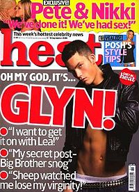
they are big company which also publish other big magazines such as, ‘Closer’, ‘Heat’
and ‘FHM’ they will have strong links with distributers and a good
understanding of how to sell my product.
I also believe that Bauer Media would be the best institution
for my media product as the current music magazine that they publish, are very
successful and have been sold to the public for a long time, for example, ‘Q’
magazine has been published since October 1986,
and many people still buy this magazine on a monthly basis.
I also believe that s my magazine is aimed at a younger audience, the
institution which published my media product, should be current and up to date,
and understand what young people want. Bauer Media is a brilliant example of
this kind of institution as they publish similar music magazine, but also highly
popular, current, gossip magazines which a lot of people, especially girls or
my target age range buy. This might mean that they are more inclines to buy
from the same or similar publishing companies. This will also work for the my
music magazine, as it is similar to products they already produce so if a
consumer wants a similar music magazine to ‘KERRANG!’, as they enjoy it, but
maybe more focused on a different genre of music, they might be more susceptible
to buying my media product as it is from a familiar and liked company but more
suitable for their tastes/requirements.
Although, using a company which already publishes successful music
magazines, might mean that the company is less inclined to buy into a new one
as it could be a risk and there simply isn’t the market for a new music
magazine.
However, I believe that my media product is best suited to this company
and would not suit other institutions. For example, the ‘National Magazine
Company’ would not suit my genre of music magazine as they publish magazine
such as ‘Good Housekeeping’, ‘Elle’ and ‘Cosmopolitan’. This magazines are
mainly fashion magazine, or magazine that would be aimed at the older lady, and
I do not feel my indie/rock magazine aimed at young people would have a place
with their company. Similarly to ‘BBC Worldwide’, who publish magazine such as ‘CBeebies’
and ‘Radio Times’ which have a family centred feel.
In conclusion, I believe that Bauer Media is the best suited media
institution to distribute my media product as it would be knowledgeable in how
to sell my music magazine, my music magazine fits in with their company and
they already have successful music magazines which show an indication that this
company would be best for my music magazine.


Monday, 25 February 2013
Final Draft


This is the final draft for my music magazine. I am pleased with the final outcome of my magazine and I feel that I have learnt a lot since beginning my preliminary task, my first draft of my music magazine to my final draft. I feel that my final draft is a lot better than my previous drafts. I feel that it has more features of a magazine, the pictures are better edited, the cover lines on the front cover have more of an impact and overall, it looks more realistic as a music magazine.
However, improvements that I would make would be to have more cover lines on the front cover, and less white space. Also to make the contents page look more appealing and colourful and also to have less white space on the DPS.
Saturday, 2 February 2013
2nd Draft


Front Cover
For my second draft, I decided to change the picture on the front cover, as I felt that the picture I used on my first draft, didn't take up enough of the page to be the focus and that it didn't fit the genre of the magazine. I decided to keep the picture and the cover lines, as they are basic features of a magazine. However, I felt that although the picture on the front took up more space, there was still too much white space and there needed to be a background, so I decided to add some flowers, to link to the 'Kara Coleman' issue, and to add more colour to the magazine. However, there picture has obviously been badly edited as there is still a chequered background from editing it on Photoshop. As I was using a different version of Indesign, I was unable to use the font 'Native'. This means that the title lacks impact and does not look realistic for the cover of a music magazine.
Contents Page
I made no changes to my contents page, except for the font that the 'Support Acts' subtitle was in. This was for the same version, that the font was not available. Although I felt that the contents page was still very plain and there was a lot of white space, I felt it was important to focus on the front cover and double page spread for my second draft.
Double Page Spread
For the DPS, I decided to break up the text on the first page, and add another picture of 'Kara Coleman' This was so that the page didn't look so unappealing and also, as in most magazine articles, they have a picture of the person/group they are interviewing. I tried to make it look as realistic as possible by adding a caption to the picture. On the second page for the DPS, I decided to carry on the interview to take up some of the white space, and use the picture I had previously used for my front cover as an extra picture for the interview. I also decided to use the same background from the front cover for the DPS to show that the background is specific to this person and issue.
Thursday, 31 January 2013
31st January 2013
Today I decided that I wanted to completely change the front cover for my magazine.
This was my previous front cover:

I decided that I wanted to change the picture on my front cover as there was too much white space, and I thought that the picture should take up more space, however when i tried to make the picture bigger, it didn't look good or how I wanted it to look.
 So in today's lesson, i picked another picture and edited it using Adobe photoshop.
First, I used the magic eraser to take away a majority of the background. Then, When i had to edit the background away fron the hair, I found that simply zooming in and using a normal eraser tool took a lot of time that I didnt have. I decided to try the background eraser tool. This meant that i could click on the area that i wanted to erase, and it would erase everything in the surround area that was the same colour. However, the difference between the backgrounf colour and the colour of my model's hair, was not that different when zoomed in, so i had to change the tolerance to a lower percentage.
 This is the new picture that I will use for my front cover, as I can make it bigger so the Cover will not have as much white space, it will be clear that she is the mair article, and it will look more like a real music magazine cover.
There is still some greay are that i need to erase from her hair on the right hand side of the picture, before i can use it for the cover.
This was my previous front cover:
I decided that I wanted to change the picture on my front cover as there was too much white space, and I thought that the picture should take up more space, however when i tried to make the picture bigger, it didn't look good or how I wanted it to look.

First, I used the magic eraser to take away a majority of the background. Then, When i had to edit the background away fron the hair, I found that simply zooming in and using a normal eraser tool took a lot of time that I didnt have. I decided to try the background eraser tool. This meant that i could click on the area that i wanted to erase, and it would erase everything in the surround area that was the same colour. However, the difference between the backgrounf colour and the colour of my model's hair, was not that different when zoomed in, so i had to change the tolerance to a lower percentage.

There is still some greay are that i need to erase from her hair on the right hand side of the picture, before i can use it for the cover.
Monday, 28 January 2013
1st Draft!
This the first draft for my music magazine.
Front Cover
I have chosen to use the font 'Native' for the title as I think it suits the genre of the magazine well, in that the magazine is a gigs and festival based music magazine, and the font resembles the font that a headline act for a gig or festival might be written in. I have also chosen to make it a redish colour, that will run throughout the whole magazine, as the main colour, as it is a similar colour the girls' hair on the front cover. I have added a barcode, date, price and website address to make it more realistic as a magazine. There is another picture on the front cover as well and more coverlines. However, there is A LOT OF WHITE SPACE, which I will fill with a background.
Contents Page
For the contents page, I have decided to have a sub-headline saying 'Support Acts' as I think it works well with the theme of the magazine. I have included the basic features for a contents page, in that there are pictures, with corresponding page numbers. There is a list of articles included in the magazine and the page numbers that link to them, and also the magazine website and page numbers. However, again, there is a lot of white space. I also added a 'Next Month' box, as I have seen many magazines that advertise what will be in next month's issue to entice the reader to carry on buying the magazine. I decided to put a box behind it, using the main magazine colour, to one, make it stand out and two, to link it back to the magazine itself.
Double Page Spread
For the first page of my double spread, I decided to put all the interview on one page and have the second page for a picture of 'Kara Coleman'. I chose to have 'Kara Coleman' in the biggest font at the top of the page, to show that it is the main article, and put it on a red box, magazine to make it a point of interest on the page and also to link it back to my magazine. I have the basic format for a magazine interview, in that there is an intro to the interview, and that the questions and answers are distinguishable. However, the page looks quite boring so I will add a picture of 'Kara Coleman' to break up the text.
The second page of the double page spread, is very plain, and it looks likes things have just been placed there randomly. It does not look like a page in a magazine article. The 'Would you Rahter' section, overlaps the picture and because of the colour of the text, it is hard to read. I will add more text and possible a different picture to this page.
The second page of the double page spread, is very plain, and it looks likes things have just been placed there randomly. It does not look like a page in a magazine article. The 'Would you Rahter' section, overlaps the picture and because of the colour of the text, it is hard to read. I will add more text and possible a different picture to this page.
Subscribe to:
Posts (Atom)